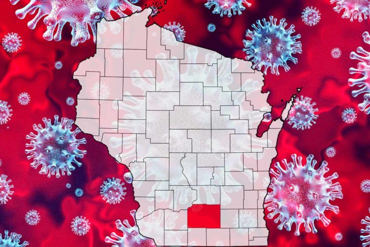
Since the end of March, I’ve kept a close eye on coronavirus metrics at both a county and state level. I have used those numbers to help with my comfort level.
I locked myself inside my house to follow the Safer at Home mandate. As numbers improved, I got comfortable enough to put on a mask and venture to some parks, get carry-out from local restaurants, and put some miles on my bike. And I’ve gotten tested along the way.
But with things going back in the wrong direction, safety and preventative measures need to be on the forefront of everyone’s minds to stop the spread of COVID-19. So if you’re interested in tracking local coronavirus metrics along with me, here are a few recommended resources.
Dane County COVID-19 Dashboard
The dashboard is a great resource to keep an eye on some county metrics. These include new cases by day, number of tests being conducted each day, and percent of tests that are % positive. The % positive is a great metric to gauge the spread of the virus locally. Looking at just an increase in the number of cases can be a bit misleading if that number is caused by an increase in testing. The % positive tests number helps balance that metric.
Dept. of Health Services Wisconsin Summary Data
I use this one mainly to keep an eye on the number of test results and % positive for the entire state.
Institute for Health Metrics & Evaluations COVID Projections
This chart can be sorted by state (the above link is for Wisconsin) and mainly graphs the total and daily deaths. There’s also some projections based on current trends. And it displays hospital resource use, so we can see how close we are to exhausting our hospital beds, ICUs and ventilators.
Dept. of Health Services Cases by Neighborhood (Census Tract)
Get really granular with this one and see the number of cases in your neighborhood.
Gating Criteria from Badger Bounce Back
This link shows the status of some of the criteria that determined the path of the Badger Bounce Back (remember that?). It still gets updated and gives us a Green or Red score for certain metrics.
Rate of Transmission Graph by State
The rate of transmission is a stat that shows how quickly the virus is spreading. A number less than 1 means the virus will stop spreading. The higher above 1 the number is, the quicker the virus is being passed from one person to the next. For example, a value of 1.25 means that every one person infected will spread the virus to 1¼ people. That’s bad. Let’s get it under 1; wear a mask!


Comments