When Forward Madison FC takes the pitch at Breese Stevens on Saturday — weather permitting — they’re going to look good doing it.
Because the Flamingos are only three games into USL League One’s inaugural season, there isn’t a whole lot of actual soccer to talk about. But we can talk about their kits! (FYI: “Kit” is fancy soccer lingo for “uniform.”)
Designed by a 23-year-old uniform novice, Forward Madison’s eye-catching light blue and pink kits and flamingo crest are considered by some to be the best in any U.S. soccer league. Not bad for a third division squad that’s only played a handful of games so far. As USL1’s best dressed, I think that makes us more than qualified to rank the attire of the other nine teams in the league.
So let’s take a look at the competition. We’ve ranked the rest of USL League One’s kits on the ’Mingo scale, with 1 ’Mingo as the lowest and 5 ’Mingos as the highest.
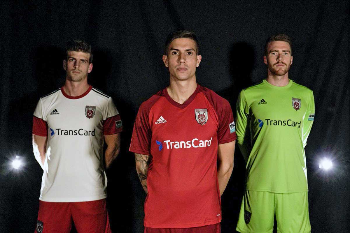
Chattanooga Red Wolves SC
Chattanooga, Tennessee
These are pretty straightforward. I like the red-on-red. It’s understated and recalls my favorite English club, Liverpool. I’m not digging the white-on-red. The red sleeves look weird on white jerseys, almost like an afterthought. Also, why are only half of the sleeves red? That’s dipping a little too far into questionable armband territory. (Which I’m sure wasn’t intentional but now we’re all talking about it.) In the end these are inoffensive enough not to warrant outright derision.
2.5 ’Mingos
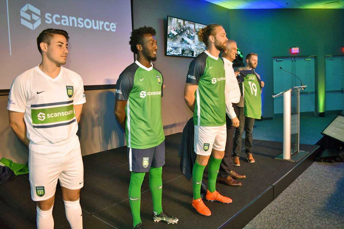
Greenville Triumph SC
Greenville, South Carolina
Now here’s a club with a good handle on color balance. The green-and-dark blue jerseys look slick, especially paired with white shorts. Their white kits are better, featuring a green stripe on the jersey and a dark blue shorts option. It’s not flashy, but it’s a classic look. Hard to fuck up, in other words.
3 ’Mingos

North Texas SC
Frisco, Texas (and a FC Dallas affiliate)
Red jerseys on white shorts, and white jerseys on red shorts. And that’s about it. I know I said before that red plays on my Liverpudlian heartstrings, but when every team starts wearing red, it stops being so striking. North Texas avoids Chattanooga’s weird armband look by going with straight colors, but they also lack anything noteworthy at all. These jerseys are boring as hell, like a high school soccer team in an underfunded district.
2 ’Mingos
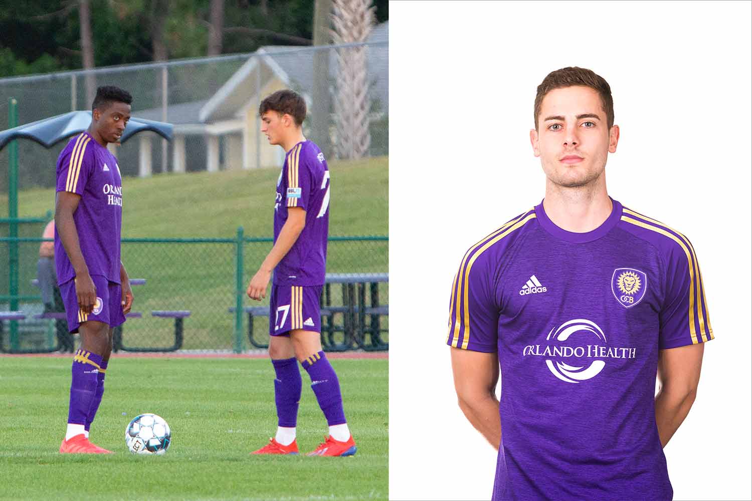
Orlando City B
Orlando, Florida (and an Orlando City SC affiliate)
On the plus side, these look nearly identical to the regal-looking kits of their parent club, Orlando City SC. On the downside, they look nearly identical to Orlando City SC. The purple and gold scheme that City uses looks fantastic. The only difference here is that City B has gold stripes on their sleeves, while their parent goes for straight purple. It’s actually a slight improvement over the MLS club, adding a little variation to what would otherwise be a mostly uninspired look.
3 ’Mingos

Richmond Kickers
Richmond, Virginia
Oh, look. Another team with red-on-red uniforms. Thank u, next.
2 ’Mingos
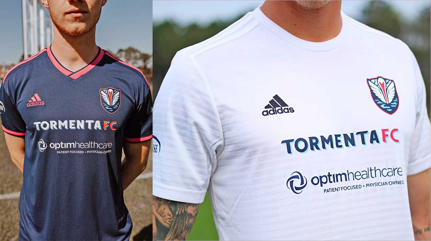
South Georgia Tormenta FC
Statesboro, Georgia
For starters, the South Georgia Tormenta might want to think about changing their logo, lest they get sued by the New Orleans Pelicans. But the Tormenta’s kits actually look pretty good. Dark blue is always a nice look, and I especially dig them being the only team in the league besides Forward Madison to use pink as a primary color. Putting the team name over the jersey sponsor seems to clutter things, but that’s about my only criticism of these kits.
3.5 ’Mingos

Toronto FC II
Toronto, Ontario (and a Toronto FC affiliate)
Alright, more red! Luckily, these Canucks avoid repetitiveness with black sleeves on their home kits. Likewise, their white kits feature red stripes to spice things up. It’s nothing special, but it gets the job done. After all, despite the saturation of red in this league, what else could you expect from a team that’s nickname is “the Reds”?
2.5 ’Mingos
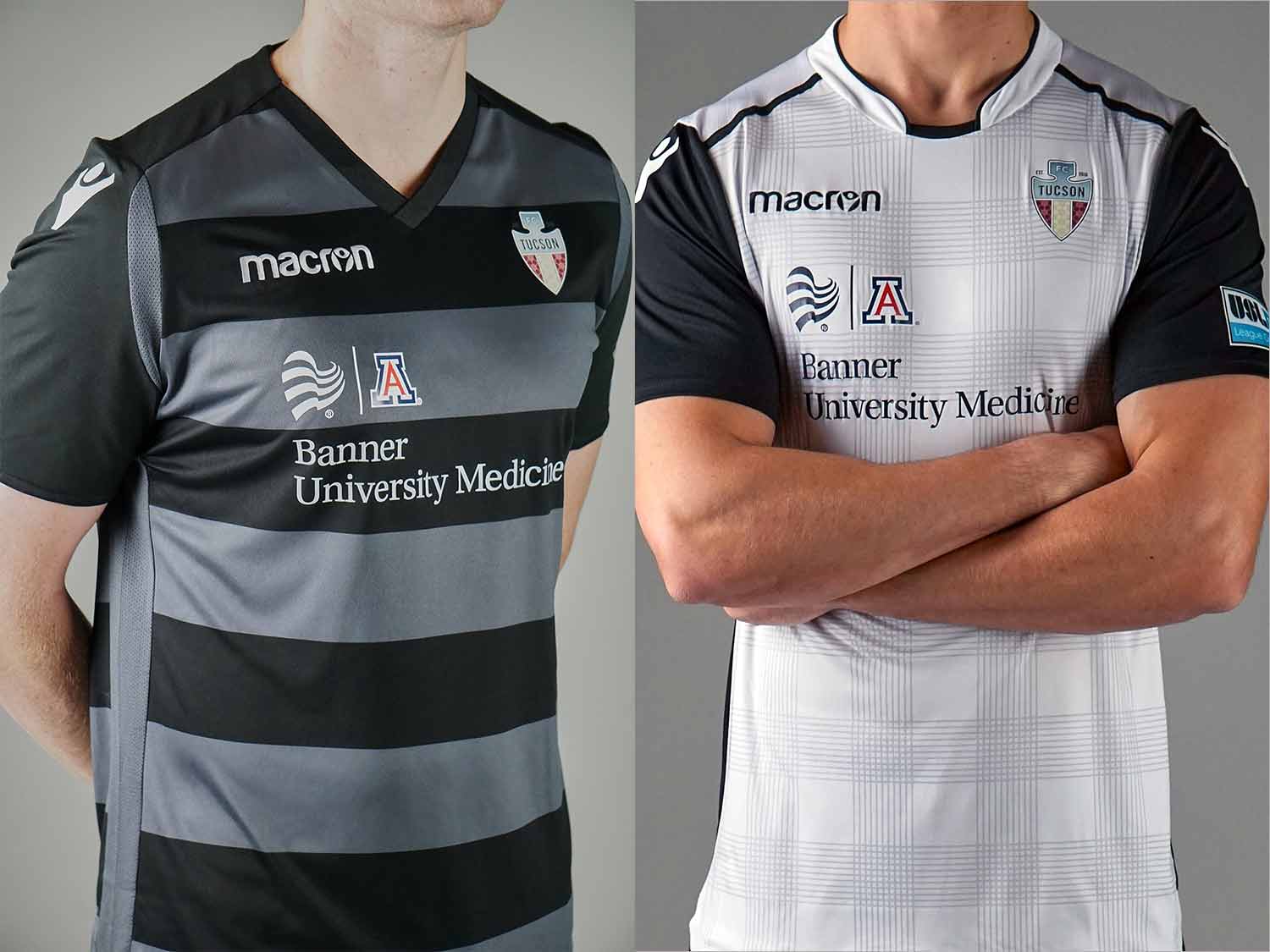
FC Tucson
Tucson, Arizona (and a Phoenix Rising FC affiliate)
There’s nothing special going on with FC Tucson’s black striped kits, but that’s special in and of itself. The black and gray stripes look nice, and the red, white and blue of FC Tucson’s crest makes for a nice accent. I’ve always been a fan of wearing one or two muted colors with a splash of something brighter. The only knock I have is the oddly positioned jersey sponsor. Center it, my dudes! It looks like a printing error!
3 ’Mingos
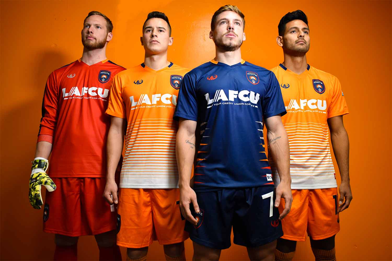
Lansing Ignite FC
Lansing, Michigan (and a Chicago Fire affiliate)
While almost every other team in the league is rocking monochrome, Lansing got creative with their kits. These are are second best kits in USL League One after the Flamingos — and by a wide margin, too. The dark blue looks great, especially with the orange and white tiger stripes on the side. And the orange jerseys look even better. They avoid plainness with scored white stripes at the bottom, a look that somewhat recalls the Dutch national team. These look great.
4 ’Mingos
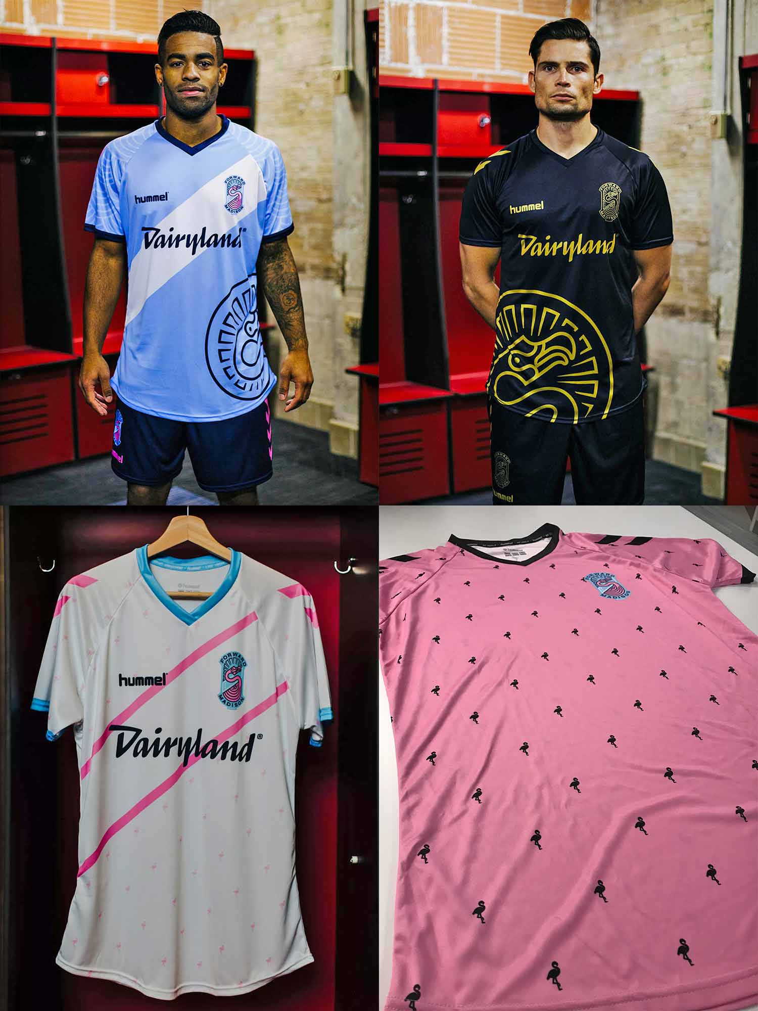
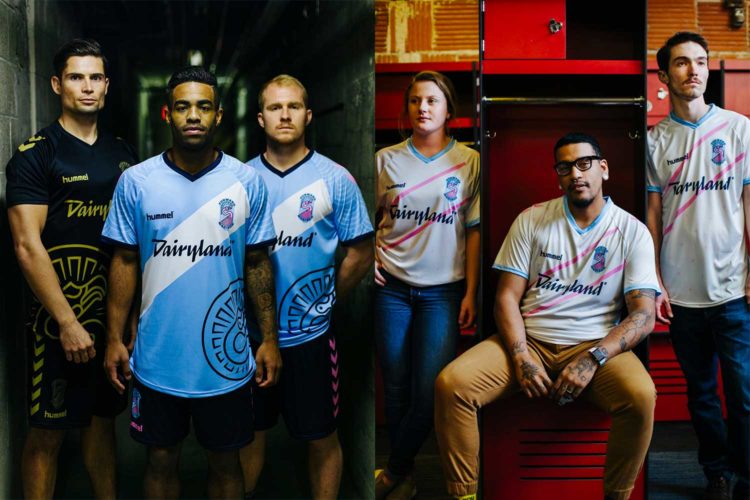
Forward Madison FC
Madison, Wisconsin (and a Minnesota United affiliate)
By nature, a flamingo stands out. So too do the Flamingos. The home jerseys are the real winners here, featuring a diagonal white stripe on light blue, mimicking the isthmus and Madison flag. (Paired with dark blue shorts with pink chevrons, natch.) The home keeper kits are an intimidating gold-on-black, a stark opposite of the goalies’ pink flamingo-patterned away kits. And on the subject of away kits, elsewhere on the field Forward Madison players wear white jerseys with a subtle pink stripe and dark shorts. It’s a uniform that matches its hometown’s vibrance, capturing its eccentric spirit.
5 — FULL ’MINGO


Comments